








People do not judge the trustworthiness of an interface by its security certificate alone. Language, visual consistency, speed, error behavior, and a sense of control work together. Good UX tells users that they understand what is happening and remain in control.
1. Use a Consistent Visual Language
The same color, icon, and behavior should represent the same function. If a blue button confirms an action on one screen but signals a warning on another, hesitation grows. Consistent components reduce learning time.
2. Write Clear, Human-Centered Copy
Instead of saying only that an operation failed, explain what happened and what the person can do next. Button labels should describe their outcome—for example, “Send Quote Request” is clearer than a generic “Submit.”
3. Make System Status Visible
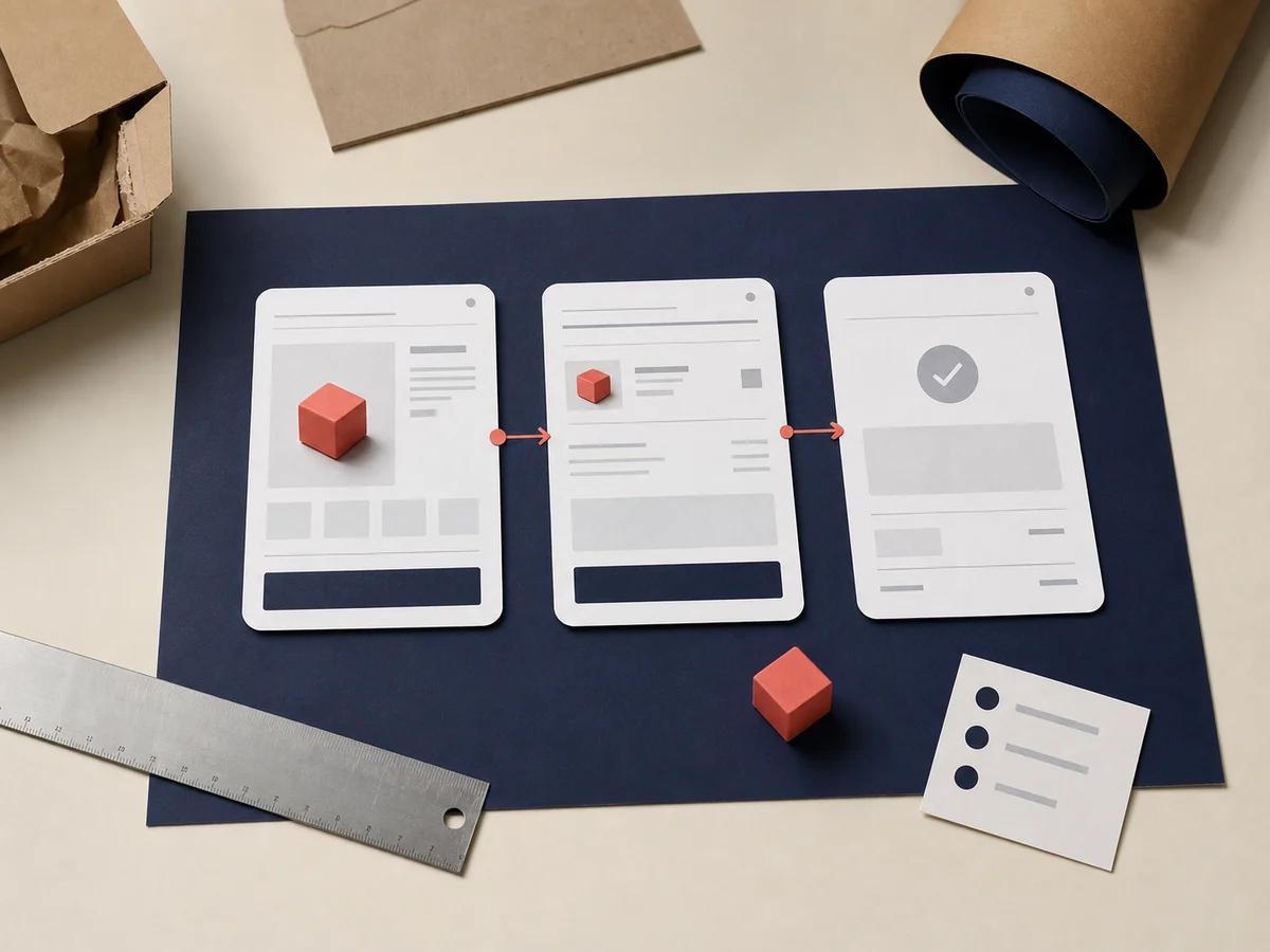
Loading indicators, success messages, upload progress, and saved states reduce uncertainty. People need confirmation that their action was received and the process is moving forward.
4. Prevent Errors Before They Happen
Helpful examples, constrained choices, and clear confirmation for irreversible actions lower risk. Strong design does more than explain errors; whenever possible, it prevents them.
5. Keep the User in Control
Undo, edit, preview, and preference controls build confidence. Forced registration, hidden costs, and unexpected redirects quickly damage it.
6. Treat Mobile as a Primary Experience
Tap targets must be large enough, text readable, and the keyboard appropriate for each input. Missing mobile content and horizontal overflow hurt both usability and the brand.
7. Make Accessibility a Quality Standard
Color contrast, keyboard support, alternative text, correct heading order, and clear form labels allow more people to use a product confidently. Accessibility is not merely a compliance check; it is evidence of thoughtful design.
8. Test with Real Users
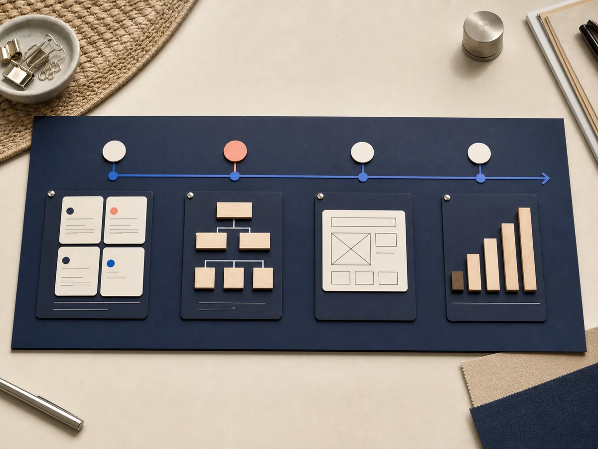
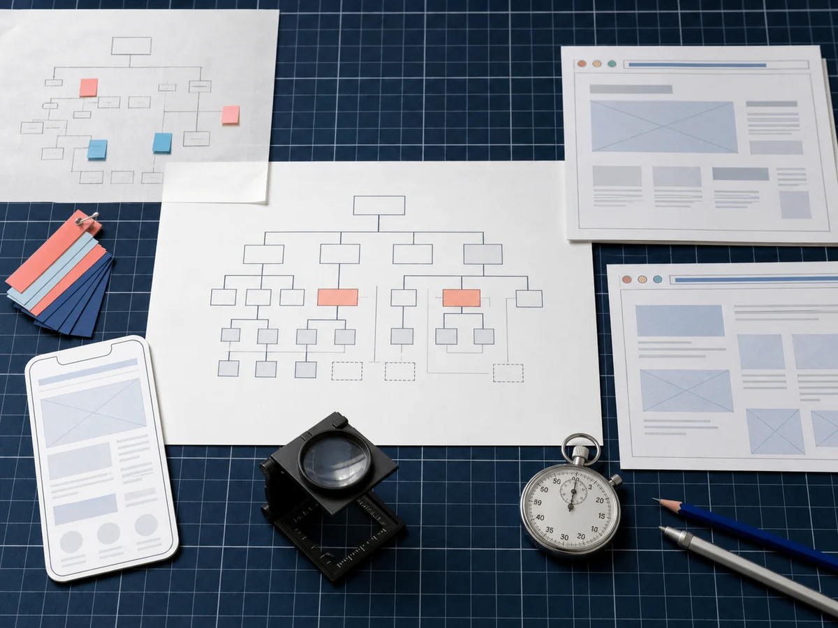
A flow that seems obvious to the project team may confuse someone seeing it for the first time. Short usability sessions, analytics, and support requests validate or correct design assumptions.
The Role of a Design System
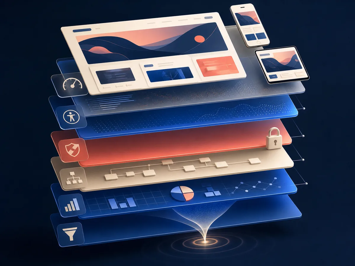
Bringing typography, colors, buttons, forms, and notification rules into one system helps every screen speak the same language. Development becomes faster, quality control becomes easier, and new features can be added without breaking the existing experience.
Conclusion
Trust is not created by a single badge or sentence. It is the result of many small, consistent decisions. At TazeFikirler, we evaluate interfaces through clarity, accessibility, and real usage—not aesthetics alone—so the brand promise remains visible in every interaction.